

Introduction
I have been a loyal user of Ubuntu Linux for a long time. There is one element of the distribution which continues to irk me – its default color scheme. But it hasn’t always been that way.
My introduction to the Ubuntu distribution falls back to version 5.10, the Breezy Badger. In its introductory years, Ubuntu performed well and had good aesthetics to boot.
Fast forward to 2020, and I think Ubuntu has come a long way with performance improvements. Yet it is disappointing to admit that it somewhat lags on the aesthetics front. The current color scheme which gets shipped is rather tired and uninspiring.
Developers continue to tweak limited elements to keep it polished, but it’s not enough. For Ubuntu to be taken serious and for the user to really appreciate the underlying grunt it holds, it needs a much more aggressive approach to be taken with the eye candy.
That’s what we are going to do today. It’s time to have some fun. Best of all, as we show you it can be done in just 10 easy steps. Ladies, gentleman and all Ubuntu geeks alike, read on.
Step 1
The first thing we are going to do is change the default window theme from the default Standard theme to the Dark theme.

Head to Settings > Appearance and change the window theme to Dark.

Step 2
Next, we are going to reclaim some useful screen real estate and move the Dock to the bottom of the screen. Having the Dock reside on the side of the screen is not only annoying, but it defies the natural formula of eye and mouse movement coordination.
Head to Settings > Appearance and at the bottom of the screen change the position of the Dock from Left to Bottom.
Now we reduce the size of the Dock to something a little less chunky and which will also allow us to reclaim some valuable screen real estate.
Change the Icon size to 32. There’s no set rule. You could keep it higher or go smaller still. But we feel 32 is a good comfortable middle value.

Step 3
For the next few tweaks which will include some improvements to the GNOME Top Bar, Windows and Desktop, we need to install the GNOME Tweak Tool.

Once installation is complete you will find the Tweak Took in the Applications menu.
Open it and head to Top Bar. As default, the Top Bar only displays minimal information. Let’s enable a few extras like Battery Percentage, Weekday and Seconds.


Step 4
Next, we are going to switch the Window control buttons back to what we still believe is the more natural position of the Left.
Open the Tweak Tool and head to Window Titlebars > Titlebar Buttons > Placement and change from Right to Left.

Step 5
Desktop icons are ugly and they are the first sign of a cluttered or disorganized operating system. They are also the quickest way to distract the eye from otherwise good aesthetics. Let’s get rid of those desktop icons.
In the Applications menu you will find the Extensions tool.
In the Extensions tool you will see the option to disable Desktop Icons.


Step 6
The default Ubuntu wallpaper is quite boring and just as uninspiring as the default color scheme. To make a real impact we need something with a bit more kick and get your system noticed.
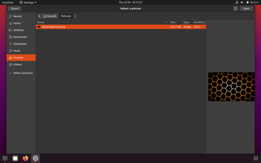
Right-click on the desktop and select Change Background.

Click on Add Picture and select the picture you want to use as your alternate background.


Step 7
As nice as our new desktop background is, it is easily ruined if we don’t make the appropriate changes to the terminal console.
To blend the terminal console, it’s preferable to select a color scheme to match the alternate background. In our demonstration, we’ve gone with a terminal console color scheme consisting of a black background and text color of #DF4A16, or orange variant.

Finish off the terminal console customization by enabling 50% transparency.


Step 8
Sticking with terminal console tweaks, we now need to install the neofetch package.

Now, open the ~/.bashrc configuration file in nano.

Head to the very bottom of the configuration code and enter the following text to the file:
neofetch --ascii_distro Linux

Alternatively, you can also just enter the following command to get the same result:
$ echo neofetch --ascii_distro Linux >> ~/.bashrc
Save and exit nano.
Now when the terminal console is launched we get something that looks extremely cool, yet still remains very functional with minimal distraction.

Step 9
We now need to install the tmux package.

Once installation is complete, maximize the terminal window and run tmux.

To enhance your terminal console productivity using tmux, you can split the session vertically and then split the left-side pane horizontally. This will give you 3 working panes inside a single session.

In the left-side pane you can the powerful combination of htop and nload. htop will allow you to monitor your system CPU usage, memory, SWAP, load averages and system processes. Below that, nload will allow you to monitor the network bandwidth, up/down net speeds.
The right-side pane you can use as your regular terminal console. This, combined with the natural terminal Tab function of GNOME Terminal, will allow for plenty of flexibility.
Step 10
Before we finish up, let’s make one final tweak.
Head to Settings > Users. Click on the profile picture next to your Username > Select a File. Change the profile picture to something cool.


Now when the operating system boots you will be presented with the login screen with your new cool profile picture loaded.
Conclusion
Now our system is complete.
Results?

You have seriously improved the aesthetics of the Ubuntu 20.04 system. People will now take your system seriously!

I find that look simply unusable and hard to see.
Dark themes in general just put me off.
What I’m looking for is a light theme that doesn’t seem to use the color blue (also hard to see) or gray, which is ugly. Whatever happened to tan or creme colors for things like the window title bars, like I had on 16.04 (or for that matter on my old Windows 98?) although I was able to change the panels (Xubuntu) to a nice tan color!